
Kio
Logo Design
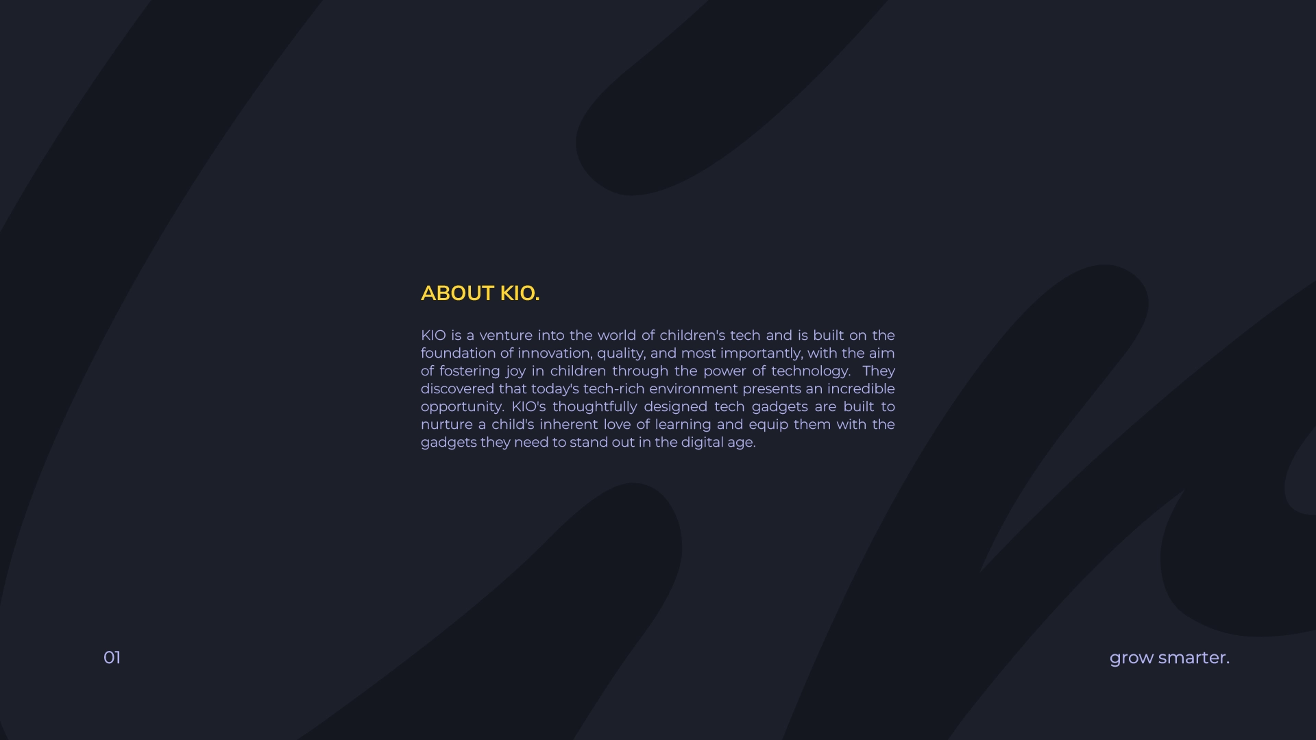
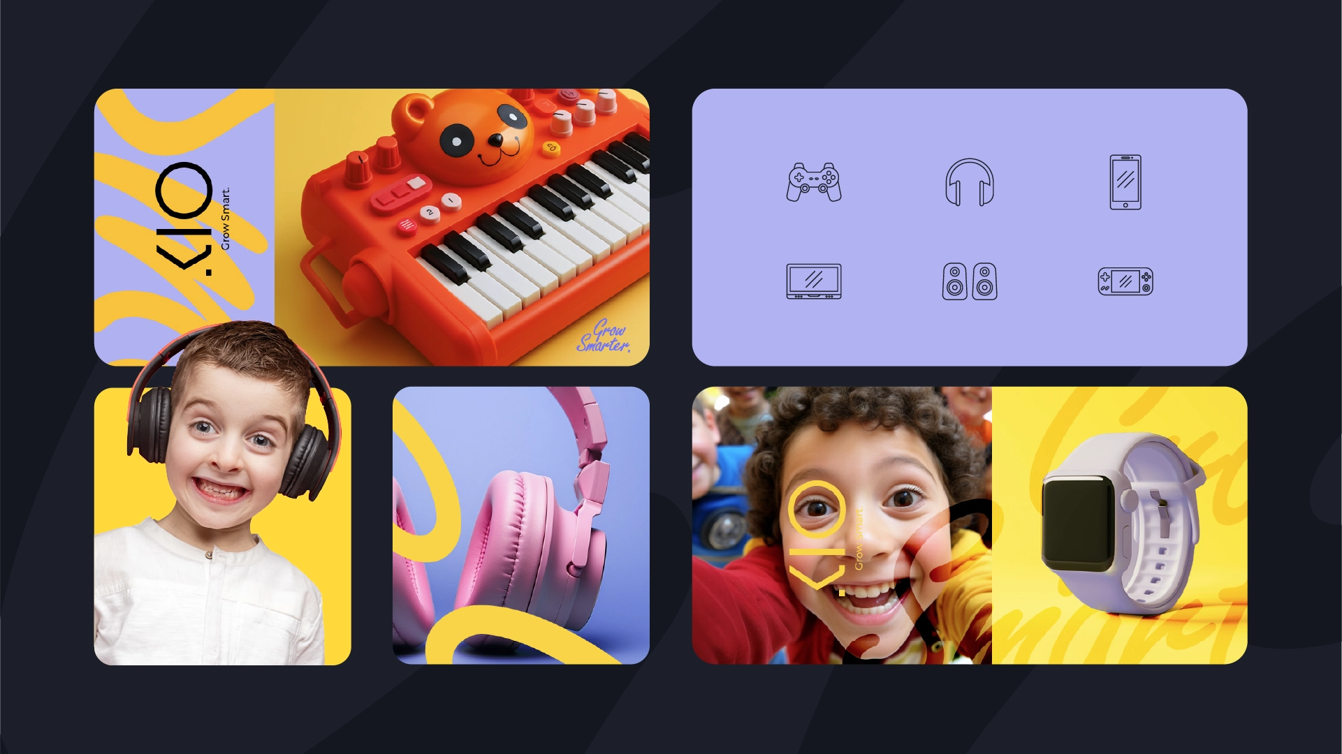
KIO, a brand on a mission to bring delight through thoughtfully designed gadgets, needed a brand language that reflected its core values: fostering a love of learning, prioritizing safety, and sparking a passion for exploration in a tech-driven world.


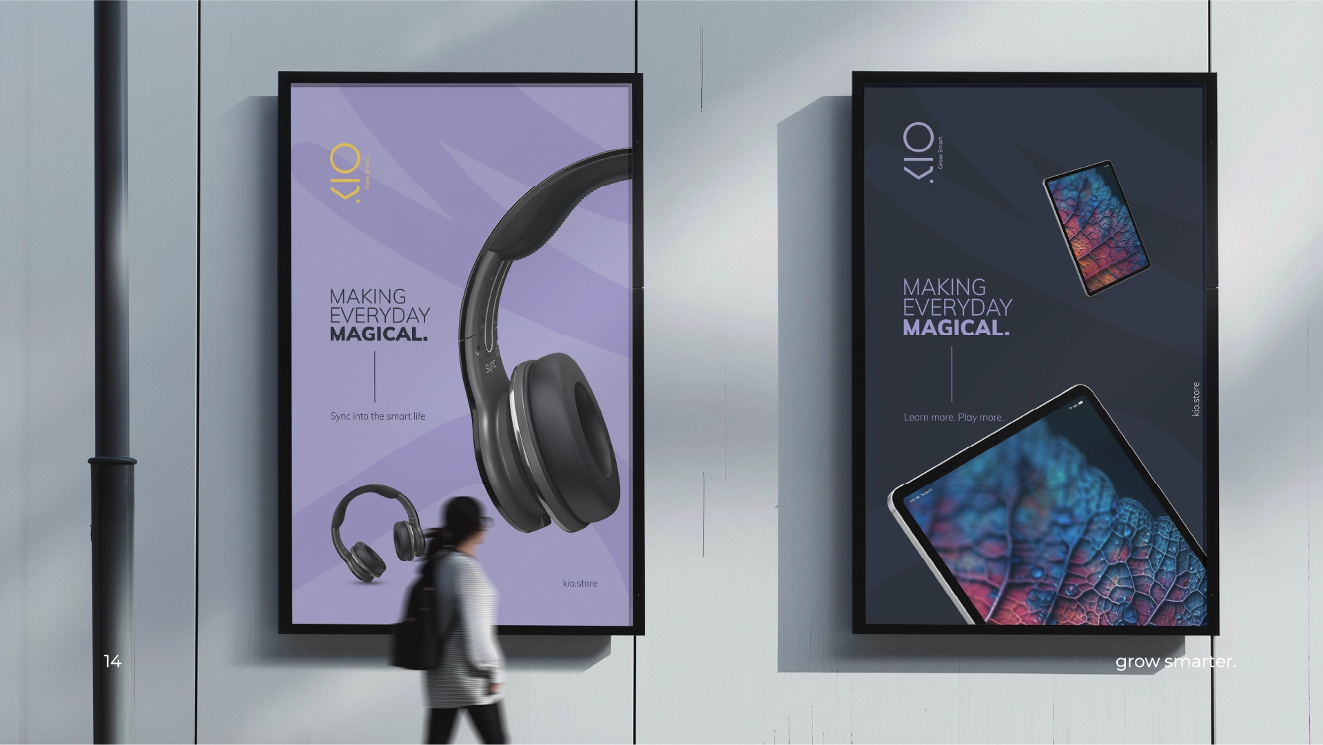
From the playful name to the vibrant visuals, AdAgency partnered with KIO to develop a brand identity that embodies the spirit of joyful tech for children, from the ground up. AdAgency started on a journey to understand KIO's essence. "Kio," meaning "joy" in Japanese, became the cornerstone of the creative strategy. This inherent sense of happiness intertwined perfectly with KIO's commitment to creating a positive and enriching tech experience for young minds.


Process
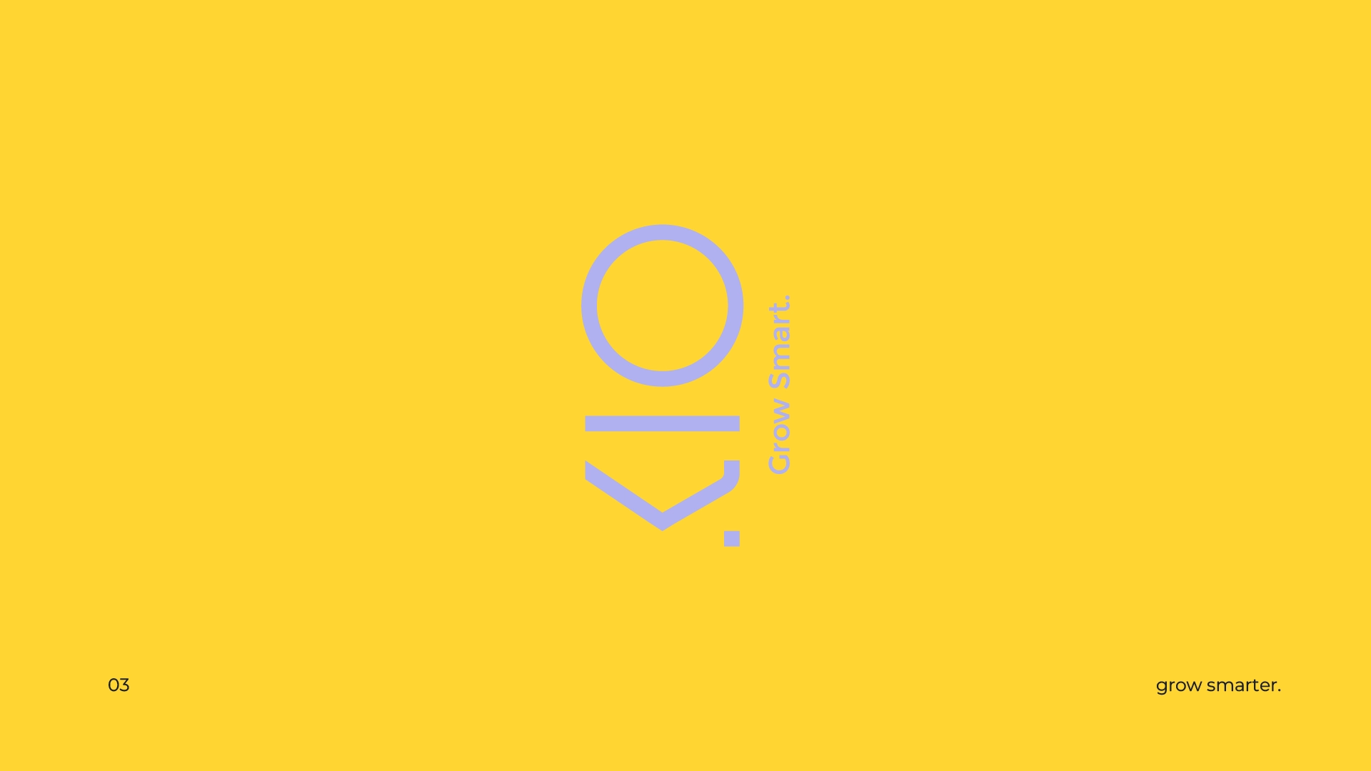
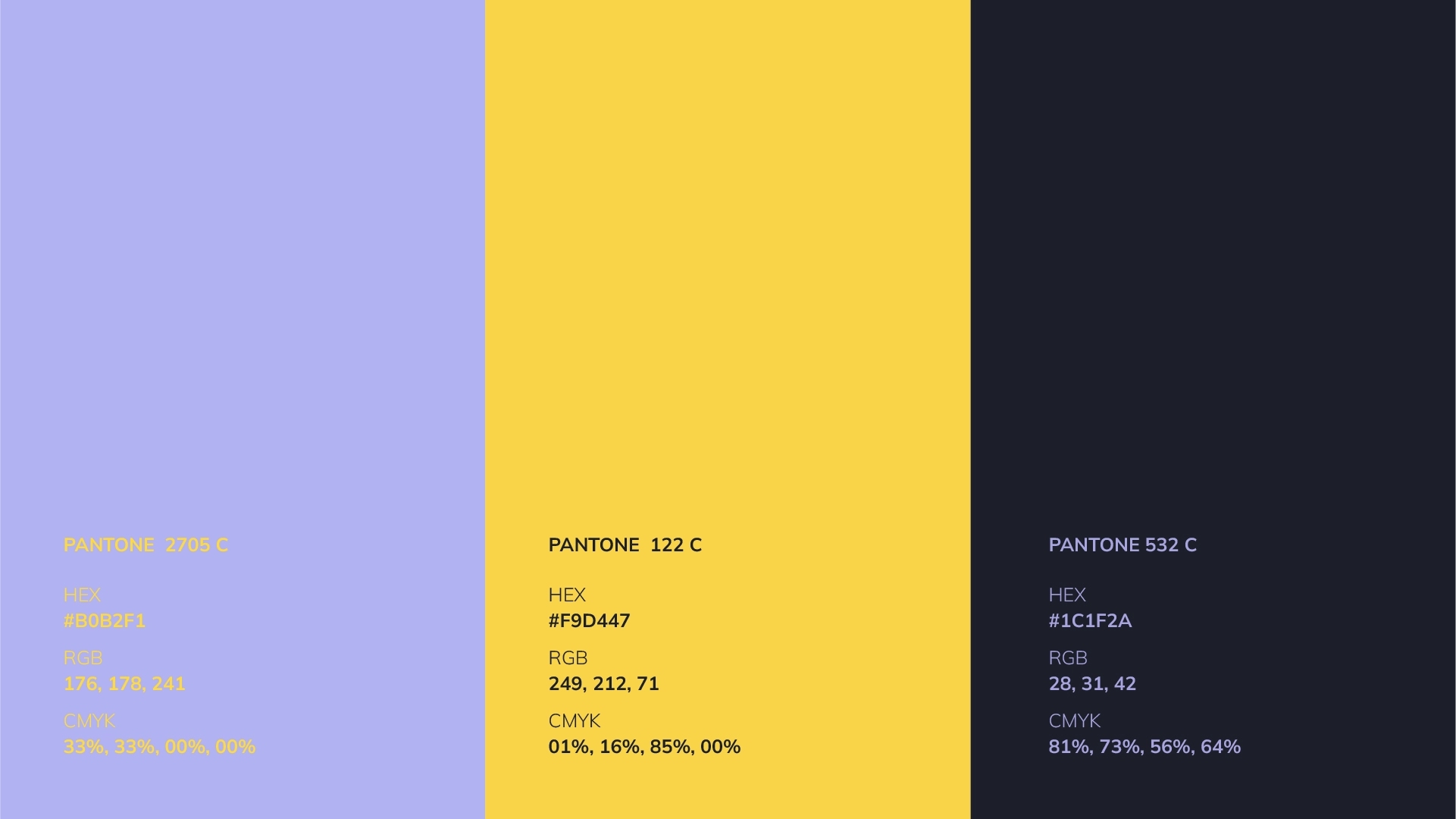
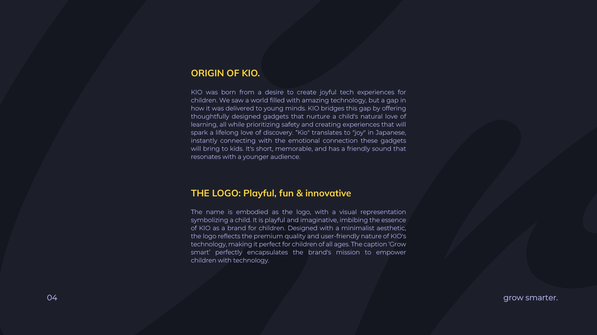
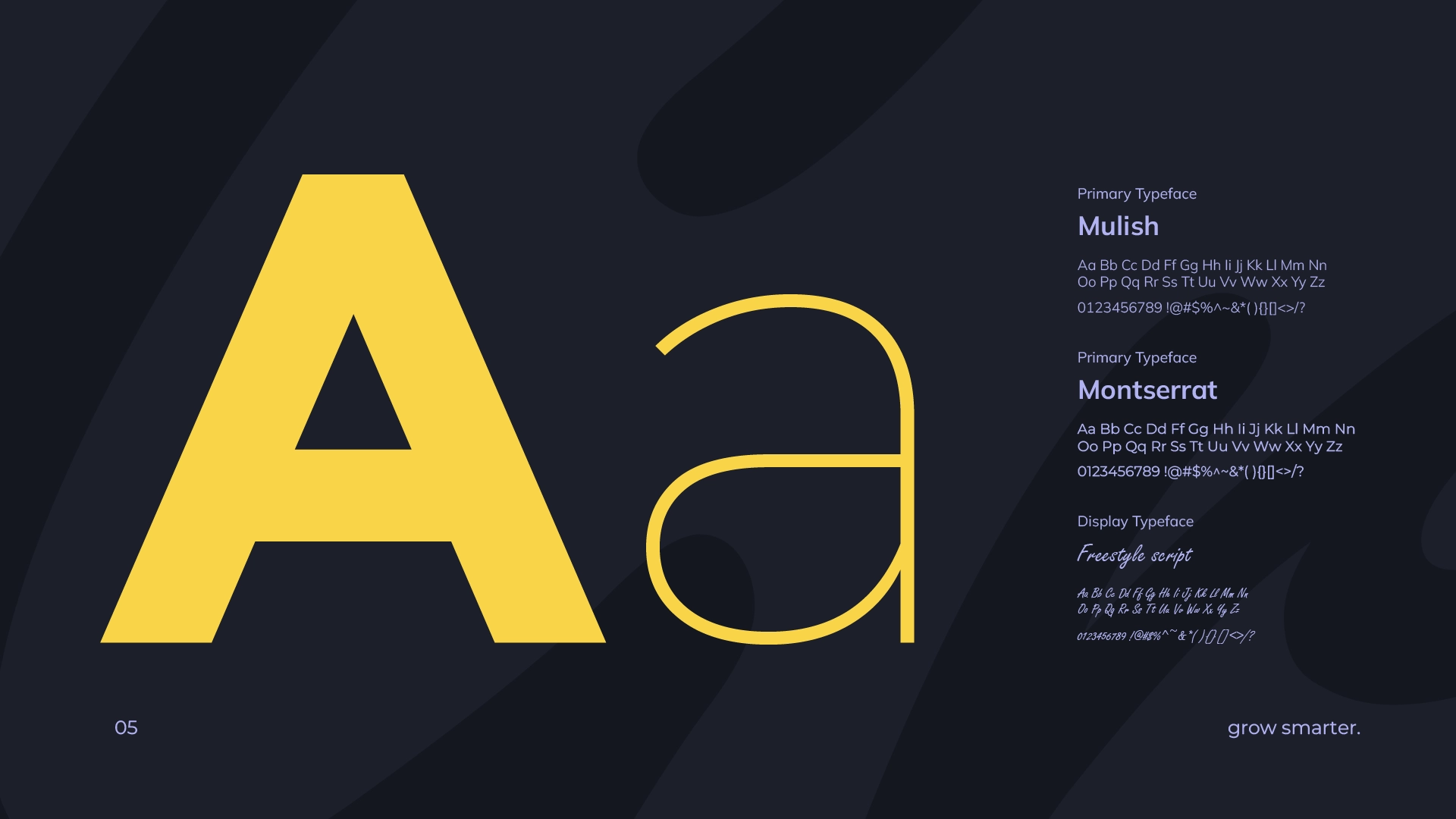
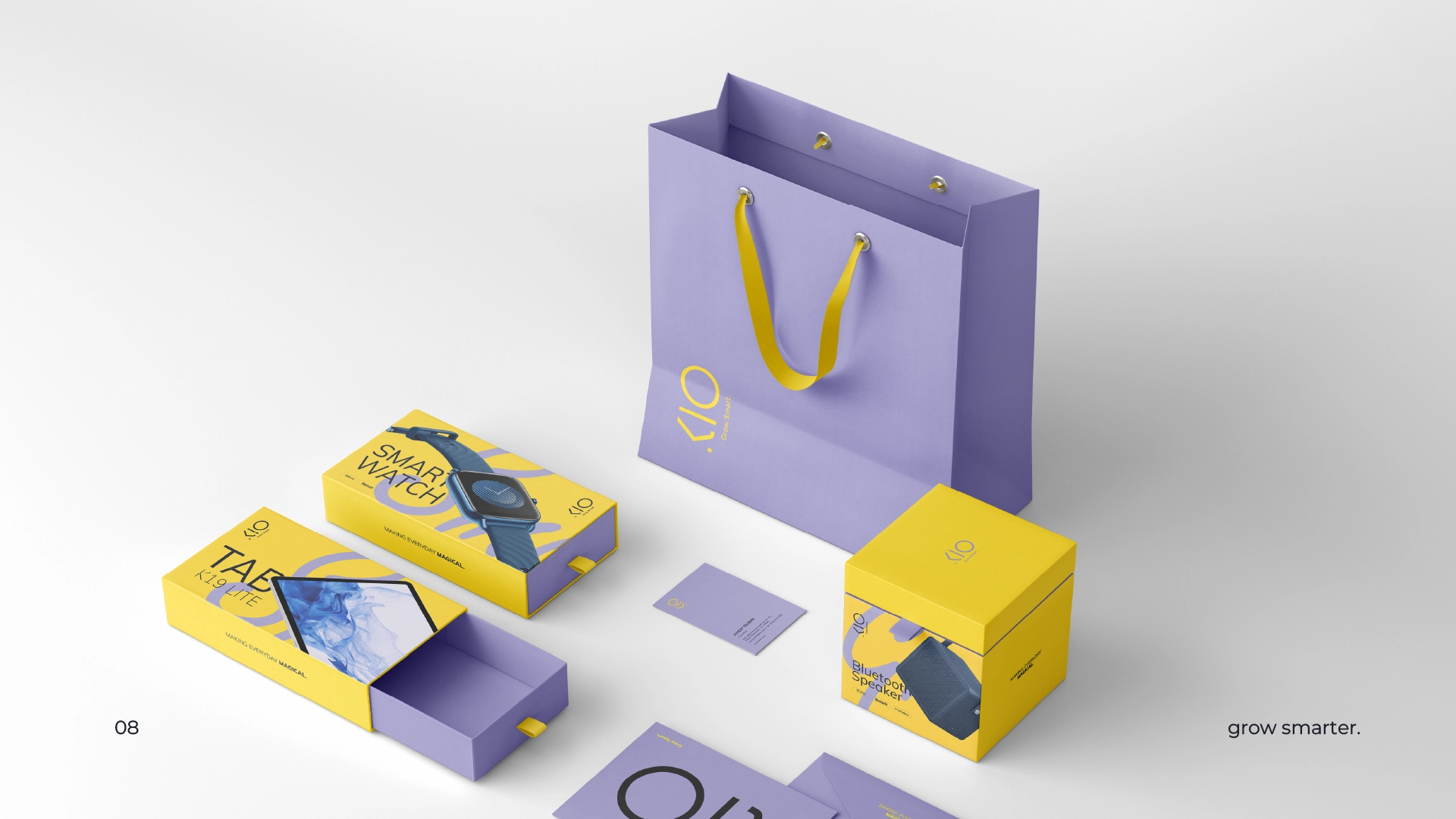
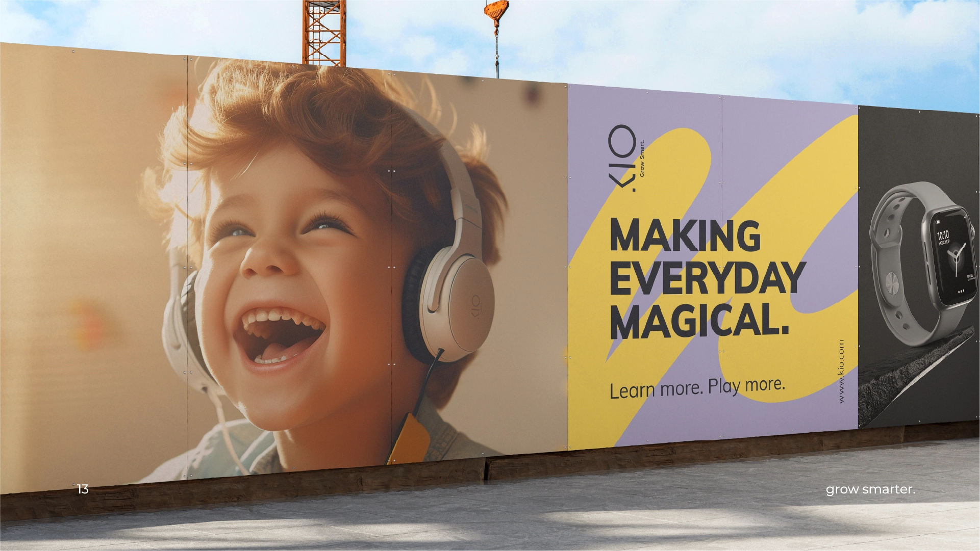
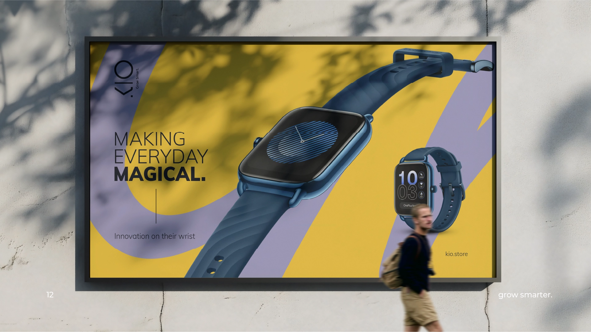
The name Kio" translates to "joy" in Japanese and was chosen because of the emotional connection the name brings. It's short, memorable, and has a friendly sound that resonates with a younger audience. The name is embodied as the logo, with a visual representation symbolizing a child. The caption 'Grow smart' perfectly encapsulates the brand's mission to empower children with technology. KIO's brand identity is brought to life through a carefully chosen color palette of yellow, black, and pastel lilac. Combined, these colors create a visual harmony that reflects the core values of KIO. The primary font, Mulish, is a playful and approachable sans-serif typeface. Its rounded curves and slightly condensed letterforms evoke a sense of friendliness and fun, perfectly suited to engage younger audiences. For secondary elements within the logo, such as the tagline ?Grow Smart?, the logo utilizes Montserrat Regular or Light.


Accounts Reached
6000+
Impressions
80K
Views
35K
Are you interested in learning more about our project?
We'd be delighted to share more details with you!
To discover more about our work or explore
our other brands, please feel free to reach out.
You can email us at hello@adagency.design
or call us at +971 54 582 1134.
